

The Multidisciplinary Powerhouse: Understanding the Data Science Process from Acquisition to Preparation
Imagine turning raw piles of numbers and facts into smart choices that shape businesses and lives. That’s data science at work. It pulls hidden truths from data, much like mining gold from rock. This field blends skills from different areas to make sense of the info explosion around us. Let’s break down its process step by step.
Introduction: Data Science – More Than Just Code
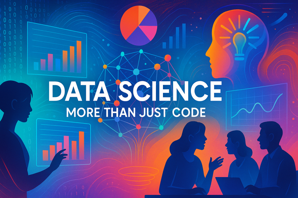
Data science stands out as a field that draws from many sources. It isn’t just one skill set. Instead, it mixes statistics, computer science, and deep knowledge of specific areas. For example, if you’re dealing with health data, you need to understand medicine basics. Law data calls for legal insights. IoT devices, like smart home gadgets, require tech know-how about sensors. These three pillars—stats for patterns, computing for tools, and domain expertise for context—make data science powerful. Without them, you’d miss the full picture.
The main goal? Extract knowledge and insights from data. You spot hidden patterns to guide decisions. Think of data as a gold mine today. Companies like social media giants dig it to personalize your feed. Whoever masters this mining creates value, builds models, and predicts trends. It’s about turning chaos into clear actions.
Section 1: Why Data Matters – The Impact of Data-Driven Decisions
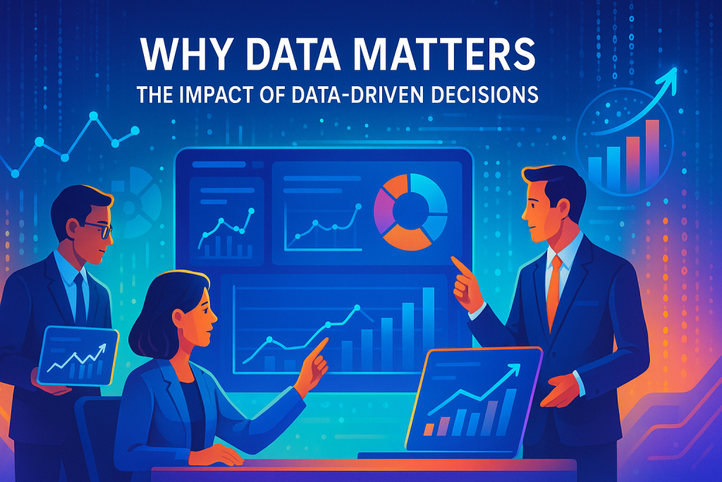
Data processing drives the backbone of platforms you use daily. Social media apps track what you watch, like, and share. Your YouTube homepage changes based on past views. One person’s feed shows cat videos; another’s gets tech talks. The same platform serves unique content. This personalization keeps users hooked and businesses growing.
Insights from data fuel predictions across fields. In weather departments, patterns forecast rain or drought. Farmers plan crops accordingly. Stock traders spot trends to buy or sell wisely. Even e-commerce sites like Amazon suggest products based on your habits. These examples show how data turns into real-world wins. Without it, decisions stay guesses.
Businesses thrive on this edge. Data helps meet customer needs fast. It spots demands before they peak. In short, data science isn’t optional—it’s essential for staying ahead.
Section 2: The Data Science Process – An Overview
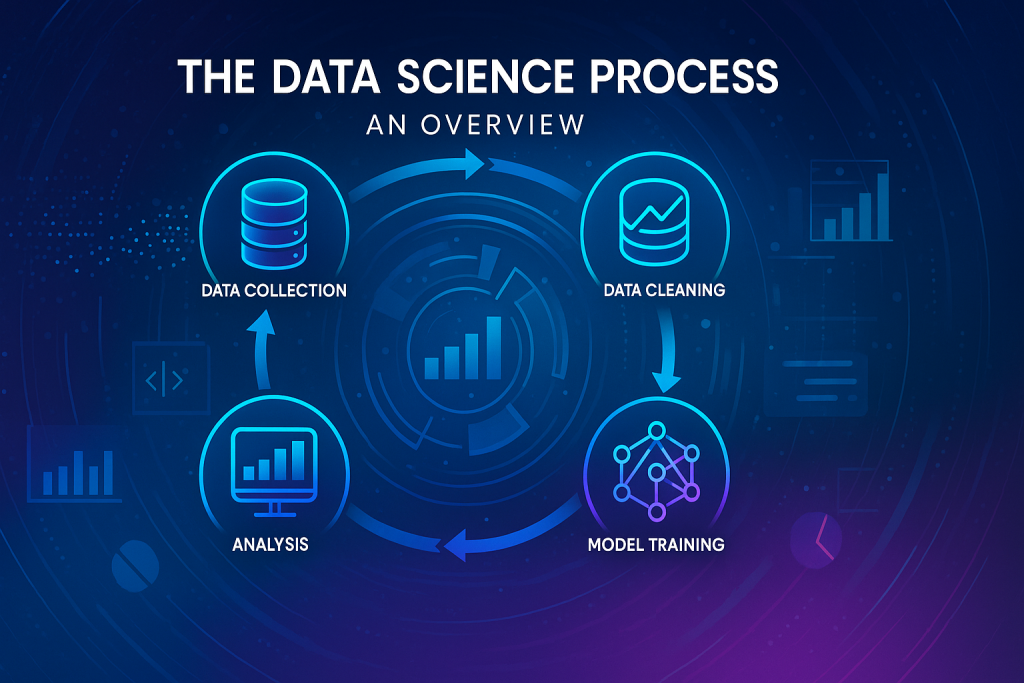
The data science process starts with grabbing the right info. You collect from various spots to build a strong base. This sets up everything that follows.
Next comes preparation, a key step often overlooked. Picture making orange juice. You can’t just toss whole fruits in—you peel and cut them first. Data works the same. Raw info needs shaping to fit models. This phase cleans and organizes, ensuring quality input for analysis. Skip it, and results flop.
From here, you move to deeper steps like modeling. But today, we focus on acquisition and prep. They form the solid ground for insights.
Step One: Data Acquisition
Gathering data kicks off the journey. You pull from databases like SQL or NoSQL setups. These hold structured info in neat rows. Hardware sensors add real-time feeds, from phones to fridges in IoT networks. Phones pack accelerometers and gyroscopes that track movement.
Data warehouses and lakes store huge volumes. Cloud services make access easy. Sometimes, data sits unused in old files—you hunt it down. Always get permissions, especially with user info. It’s sensitive stuff.
Sources vary by problem. For health apps, grab patient records. Stock analysis? Pull market feeds. List out options for your task. This exercise sharpens your hunt.
Step Two: Data Preparation (The Crucial Input Stage)
Prep turns messy data into usable form. It’s like prepping meal ingredients—chop, wash, measure. Without this, your analysis tastes off.
You explore first to grasp what’s there. Then preprocess to fix flaws. This ensures models run smooth. High-quality data leads to sharp insights.
Think of it as the bridge to action. Prep takes time, but pays off big.
Section 3: Understanding Your Data – the Exploratory Data Analysis (EDA) Foundation
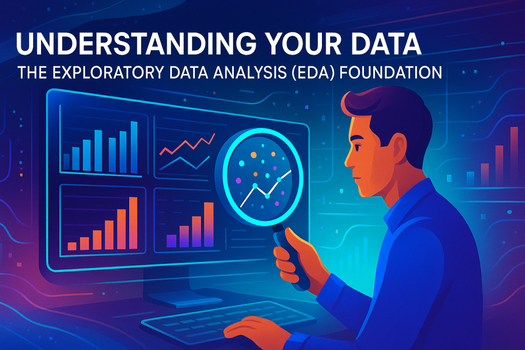
Exploratory data analysis helps you know your data inside out. You ask key questions to map it. This builds intuition before diving deeper.
Focus here lands on structured data—think Excel sheets with rows and columns. Unstructured types like audio or videos come later. Tables make patterns easier to spot.
EDA uncovers quirks. It flags odd values or gaps. You end up with a clear data story.
Structured vs. Unstructured Data Types
Structured data fits tables neatly. Rows show records, like people entries. Columns hold traits, such as age or name. It’s ready for quick queries.
Unstructured data lacks that order. Emails, photos, or speeches fall here. They need extra work to structure. But structured data drives most beginner projects.
Stick to tables for now. They form the core of many analyses.
Key Questions for Data Understanding
To grasp data, start with attributes. These are your columns—what details do they capture?
Next, check value types. Does an attribute take numbers or categories?
Finally, study distribution. How do values spread? Stats answer this.
These questions guide your EDA. Answer them, and data feels familiar.
Identifying and Defining Attributes (Columns)
Attributes define your dataset’s makeup. In a person file, you might have name, gender, hair color, job, age, height, weight. Health adds flags like COVID status or blood pressure.
Each tells a piece of the story. Name identifies; age shows life stage. List them all to see the full view.
No dataset skips this. It’s your starting map.
Determining Attribute Value Types
Values vary by attribute. Names use letters—categorical. Ages take numbers. Hair color picks from black, brown, gray—limited options.
Numeric ones allow math: add, average. Categories just count frequencies.
Know this to pick right tools. It avoids mix-ups in analysis.
Analyzing Data Properties and Distribution
Distribution shows value spread. In a million records, 50% might have black hair, 30% gray. Stats reveal the lean.
Properties include central pull and scatter. We’ll cover those next.
This view spots biases early. Clean data starts here.
Categorizing Data Attributes
Group attributes by type for better handling. It shapes your approach.
Common types fit most cases. Learn them to work faster.
Nominal and Binary Attributes
Nominal data has no order. Names like Shiraz or Harris fit here. Count frequencies—that’s your main trick. No adding or ranking.
Binary is nominal’s simple cousin. Just two choices: smoker or not, COVID positive or negative. Use 0 and 1 for easy math.
These build basic profiles. They’re everywhere in datasets.
Ordinal Attributes
Ordinal data adds order to categories. Job ranks—lecturer, assistant professor, full professor—climb in seniority. Order matters, but gaps aren’t equal.
You can rank, but not always average. It’s like steps on a ladder.
Professions or ratings often use this. It adds depth without full numbers.
Numeric Attributes (Discrete vs. Continuous)
Numeric data invites calculations. Height, weight, salary—all measurable.
Discrete counts whole things: years like 2001, 2002—no halves. Continuous flows with decimals: 5.7 feet tall or $45,250 salary.
Absolute zero matters sometimes. Temperature has no true bottom at 0°C. Experience does—zero means none.
This split guides stats choices. Pick wisely for accuracy.
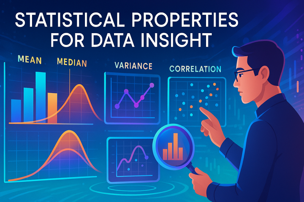
Section 4: Statistical Properties for Data Insight
Stats turn data into stories. They measure center, spread, and links.
Apply them to numeric columns. Visualize as a list of numbers.
These tools reveal truths hidden in rows.
Measures of Central Tendency (The Data’s Center)
Central tendency finds the data’s lean. It points to the middle ground.
Three main ones help here.
- Mean (Average): Add values and divide by count. Simple for balanced sets.
- Median (Middle Value): Sort data, pick the center. Ignores extremes well.
- Mode (Most Frequent Value): Spot the top repeat. Great for categories.
Each fits different shapes. Mix them for full view.
Measures of Dispersion (Spread Around the Center)
Dispersion checks how data fans out. Is it tight or wild?
It pairs with center measures.
- Variance and Standard Deviation: Gauge distance from mean. Use with averages.
- Quartiles and Interquartile Range (IQR): Split data into quarters. Pairs with median for robust spread.
Tight spread means consistency. Wide ones signal variety—or issues.
Measures of Proximity (Attribute Relationships)
Proximity links attributes. How close are age and income, say?
Focus on strength and direction. Direct: both rise together. Inverse: one up, other down.
Tools like dot product or cosine similarity quantify this. They come from math basics.
Spot these to find influences. It sharpens predictions.
Data Distribution Shapes
Distributions paint value patterns.
Symmetric ones mirror like a bell curve—balanced.
Asymmetric, or skewed, tilt left or right. Positive skew pulls right; negative left.
Shapes warn of outliers. Bell curves suit many models.
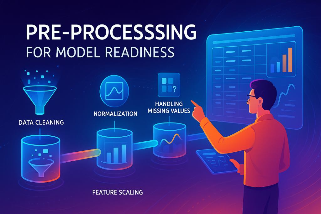
Section 5: Pre-processing for Model Readiness
Preprocessing polishes data for models. Raw input leads to junk output—garbage in, garbage out.
Aim for accuracy, no gaps, low noise. Models then shine.
This stage boosts quality across the board.
The Goal: Achieving High-Quality Data
Quality means consistent, full, clean info. Fix wild entries like 670-year age or 3000kg weight.
No inconsistencies or duplicates. Make it interoperable—easy to mix.
Better data yields better models. It’s worth the effort.
Key Preprocessing Stages
Four main tasks shape this phase. No strict order, but all matter.
Tackle them to ready your set.
Data Cleaning
Cleaning wipes out flaws. Remove noise like odd values. Handle missing spots—fill or drop.
Inconsistencies? Standardize units. It’s data engineering territory.
Result: A tidy base free of junk.
Data Integration
Integration merges sources. Pull from databases or lakes, blend without duplicates.
Match schemas—age column here, birth year there? Align them.
Tools like Hadoop or Spark help big merges. Keep quality high.
Data Reduction and Dimensionality Reduction
Reduction trims fat. Drop duplicate columns giving same info.
Dimensionality cuts useless traits. From 100 columns, keep 25 key ones.
PCA boils down features via math like eigenvalue decomposition. t-SNE embeds neighbors for visuals.
Saves compute power. Focuses on what boosts results.
Data Transformation (The Next Frontier)
Transformation reshapes data. Scale numbers, encode categories.
It fits models’ needs. Details fill a full talk—we’ll hit it next time.
This final touch perfects your prep.
Conclusion: The Roadmap to Insight
Data science thrives on solid process. Start with acquisition from databases and sensors. Prep via EDA—know attributes, values, stats like mean and variance. Then preprocess: clean, integrate, reduce, transform.
Master these for fields like AWS or Azure work. Data roles grow fast—build skills now.
Visualize tables as you learn. Practice stats on sample sets. Ready to extract your first insights? Dive in and experiment today.