

Mastering the Data Science Process: From Acquisition to Actionable Insights
Imagine you have a pile of raw data, like a messy room full of clues. Without a clear plan, it’s just chaos. But if you follow the data science process step by step, that mess turns into smart decisions that drive real business results. This workflow covers five key stages: acquire, prepare, analyze, report, and act. Each one builds on the last, and skipping any means your insights stay stuck. The real power comes when top managers use those findings to make changes. Let’s break it down so you can see how it all fits together.
Data Acquisition and Preparation: Laying the Foundation
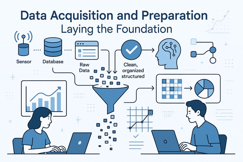
You start the data science process by grabbing the right data. Call this the acquire stage. It’s like hunting for ingredients before cooking a meal. Once you have the data, you move to prepare it. This phase has two main parts: exploratory data analysis, or EDA, and preprocessing.
In EDA, you dig into the data to understand its basics. Ask simple questions: What makes up this data? How does it look overall? This helps spot patterns early.
Acquiring and Understanding Data Attributes (EDA)
EDA is your first deep look at the dataset. You need to know the types of attributes to handle them right.
Binary attributes have just two options. Think smoker or non-smoker, or COVID positive or negative. These keep things simple.
Ordinal attributes add order to categories. School ranks work here—first place beats second. Grades like A, B, or C show the same idea. Even spellings of first, second, third carry that rank.
Most attributes are numeric, though. You can run math on them. This type lets you apply stats to find trends.
Statistical Measures for Data Understanding
Stats help summarize numeric data fast. They reveal the heart of your numbers.
Start with measures of central tendency. Mean is the average. Median splits data in half. Mode shows the most common value. These pinpoint the middle ground.
Next, check dispersion. This tells how spread out the data is from the center. Standard deviation and variance measure scatter around the mean. For median, use quartiles and interquartile range.
Proximity measures how close attributes link. Dot product compares vectors. Cosine similarity checks angles between them. Correlation spots linear ties. Use these to decide if attributes pair well or not.
Data Distribution: Identifying Shape and Symmetry
Data distribution shapes how you analyze it next. Picture it as the overall flow of values.
Normal distribution, or Gaussian, looks like a bell curve. It’s symmetric around the mean or median. Most real-world events follow this—think heights or test scores. When you hear “normal,” see that even spread on both sides.
Asymmetric distributions skew one way. Positive skew has a tail on the right. Negative skew pulls left. To spot skew in big sets, like a million records, compare mean, median, and mode.
In symmetric data, all three values cluster close. Skewed data shows gaps. If mode is less than mean, it’s positive skew. Flip that for negative. This quick check—your stats summary—guides further steps.
Advanced Data Preprocessing: Ensuring Model Quality
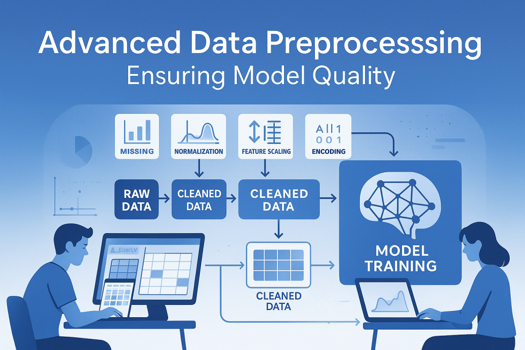
Good preparation means clean, ready data. Preprocessing fixes issues so models learn well. Without it, your analysis flops. Focus on four tasks: cleaning, integration, reduction, and transformation.
Cleaning and Integration: The Quality Check
Cleaning removes junk first. Inconsistencies pop up, like an age of 670 years—no one lives that long. Spot and fix them.
Missing values hurt too. If age blanks out, you can’t draw insights. Fill or drop them wisely.
Integration pulls data from various sources. Duplicates and noise creep in. Overload happens with too much info.
Big data tools help here. Data lakes store raw stuff. Warehouses organize it. Hadoop and Spark handle the load. Cloud computing pairs with big data for processing power.
Dimensionality Reduction Techniques
Too many columns waste time. Reduction cuts them without losing key info.
Why bother? It speeds up computation and avoids clutter. You trim rows and columns.
Principal Component Analysis, or PCA, shines. It uses math to shrink the set. Linear algebra finds the essence.
Data Transformation: Crucial Steps for Model Learning
Transformation reshapes data for better model fits. Scatter hurts learning, so smooth it out.
Smoothing uses regression to even bumps. Binning groups values too.
Discretization turns continuous numbers into categories. Say temperature from 0 to 50 degrees. Bin as low (0-15), medium (15-30), high (above 30). Numeric becomes ordinal—easier to manage.
Feature construction builds new traits. Combine old ones into useful ones.
Feature Construction/Engineering: Creating Meaningful Inputs
Feature engineering is gold. Before 2000, 80% of research focused on it. Today, companies thrive on this alone.
Take person data: name, hair color, profession, height, weight. Add BMI—body mass index. Formula: weight divided by height squared. BMI flags obesity or fitness needs.
This new feature packs power. Smartwatches track steps, calories, and BMI. Apps use it for tailored advice on food, meds, clothes.
One BMI shapes markets. Obese users need different products than fit ones. Hundreds of industries profit from such insights. Build a business just on feature extraction—no coding required if you grasp formats.
In a medical store’s 10-year data, patterns emerge. Sales link to weather, seasons, patient ages. Extract those without queries. Like reading body language to guess moods—combine small signs for big reads.
Train your brain for this. Spot threads in data haystacks. Clients close deals on these revelations. It’s not rote; it’s pattern hunting through practice.
Normalization: Preventing Feature Dominance
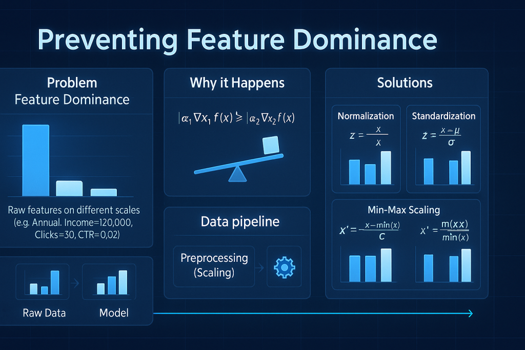
Features with wild scales confuse models. Normalization evens the field.
The Need for Feature Scaling
Income might hit millions. Age stays under 100. Height tops 10 feet. Models weigh big numbers heavier, ignoring small ones.
Both matter equally for person profiles. Unscaled data skews predictions wrong.
Goal: No feature bosses others by size alone. Scale all to similar ranges, like 0 to 1.
Don’t mix with database normalization—that restructures tables. Here, it’s data science scaling.
Primary Normalization Techniques
Z-score normalization uses mean and standard deviation. Subtract mean, divide by deviation. Values center at zero with unit spread. Also called standard scaling.
Min-max scaling maps to a range. Use min and max values. Formula squeezes everything between 0 and 1, or -1 to 1. Pick your bounds.
Decimal scaling shifts decimals but sees less use.
Standard scaling handles unseen data well. Min-max fits if max values won’t exceed training set.
Data Analysis: Building and Validating Models
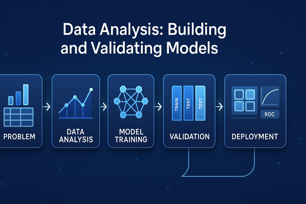
With clean data, analyze. Pick models based on your goal—numbers or categories.
Selecting Algorithms Based on Problem Type
Numeric outputs need regression. Linear regression fits lines. Logistic handles probabilities. Random forest and decision tree regressors ensemble strengths.
Categories call for classification. K-nearest neighbors finds close matches. Decision trees branch choices.
Advanced tricks: Bagging votes multiple models. Boosting fixes errors in sequence. XGBoost and AdaBoost lead here. Random forest bags trees.
Deep networks work too. Fully connected for regression. Add layers for classification.
Model Building and Iterative Training Cycles
Build via experiments. Try several algorithms. Train, tweak, repeat—at least five cycles per model.
Data and analysis drive choices. Wrong picks waste effort.
Model Validation and Evaluation Metrics
Pick the best model objectively.
For regression: R-squared shows fit. Root mean square error, or RMSE, measures average error. Residual analysis checks over or under estimates.
For classification: Confusion matrix tracks true vs. false predictions. Accuracy is overall correct rate. Precision hits true positives among predicted. Recall catches all actual positives.
Reporting and Action: Translating Technical Results
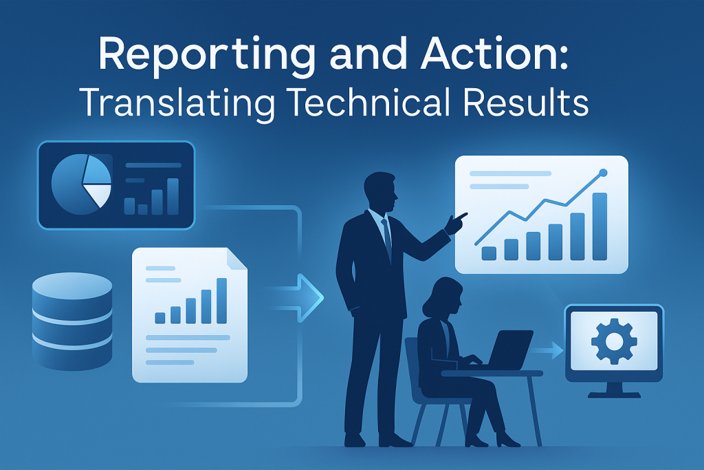
Analysis done? Report it simply. Decision-makers need clear stories, not tech talk.
The Power of Data Storytelling Through Visualization
Visuals summarize billions of records. A pie chart shows customer types: top category here, second there. Skip raw plots—add meaning.
One graph tells a tale. Why show this scatter? To reveal trends without drowning in details.
Actionable Insights vs. Technical Detail
Clients pay for value. Technical jargon confuses. Translate to actions: “Cut costs here based on patterns.”
Without action, effort vanishes. Top managers apply insights for business wins.
Conclusion: The Continuous Cycle of Data-Driven Improvement

The data science process flows from acquire to act. Acquire raw data. Prepare through EDA and preprocessing—clean, integrate, reduce, transform with smoothing, features, and normalization. Analyze by selecting models, building iteratively, and validating with metrics. Report via visuals that storytell. Finally, act to turn insights into decisions.
Key lesson: It’s cyclic. Retrain models. Practice pattern spotting. Train your mind over memorizing. Start today—grab a dataset, explore, and build. You’ll thrive in data science. What’s your first project? Dive in now.