

Mastering Data Preprocessing for Classification: Loading, Visualizing, and Cleaning the Titanic Dataset in Google Colab
Imagine you’re on the Titanic, and your job is to predict who survives based on clues like age, class, and gender. That’s the thrill of machine learning classification. In this guide, we’ll walk through loading the Titanic dataset in Google Colab, exploring it with visuals, and cleaning it up so your models can shine.
We’ll start by setting up your workspace and grabbing the data. Then, we’ll dig into charts that reveal hidden patterns. By the end, your dataset will be ready for training classifiers. Let’s get your hands dirty with real code and insights.
Introduction: The Foundation of Machine Learning Success

Success in machine learning starts with solid data handling. You connect to Google Colab’s basic runtime—no fancy GPU needed at first. This keeps things simple and fast for beginners.
Structured data like CSV files is your main friend here. These comma-separated files hold tidy rows and columns, much like a spreadsheet. Load them right, and you’ll spot issues early.
Always check if your runtime is linked before you begin. A quick glance at the connection status saves headaches later. Think of it as double-checking your lifeboat before sailing.
Setting the Stage: Understanding the Titanic Classification Problem
Your goal? Predict if a passenger lived or died— a binary choice. The Titanic dataset packs info on 891 people from that fateful 1912 voyage. Use features like age and fare to classify outcomes as yes or no.
Classification deals with categories, not numbers like regression does. Here, “Survived” is nominal data: just 0 or 1. It’s a special binary type, perfect for spotting patterns in survival chances.
Why Titanic? It’s a classic for new coders. You’ll learn to turn raw info into smart predictions. Questions like “Did class matter?” pop up as you explore.
Section 1: Environment Setup and Initial Data Ingestion
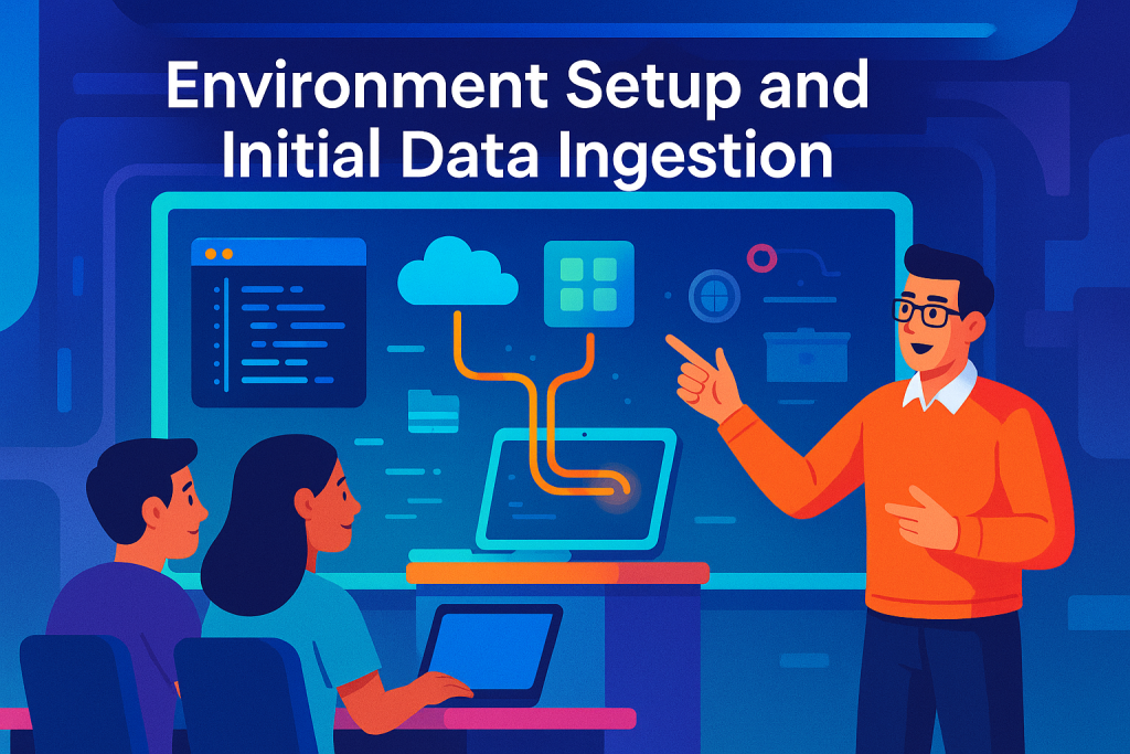
Fire up Google Colab and link to a standard runtime. No extras required; it pulls in free resources like storage. On the left, spot the file panel with icons for search, variables, and folders.
Click the folder icon to see your files. There sits the Titanic CSV— a simple data file packed with passenger details. If it’s not there, use the upload button; a browser window pops open for quick drags.
This setup lets you browse and grab files easily. Colab turns your browser into a coding playground. Keep it organized, and you’ll fly through data loads without snags.
Essential Library Imports for Data Science Workflow
Start by importing key tools. NumPy handles math crunching on numbers. Pandas builds data frames—think Excel sheets on steroids—for easy slicing and dicing.
Matplotlib draws basic charts, but Seaborn amps it up with pretty colors and ready-made plots. It’s like Matplotlib’s stylish cousin, built right on top for quick visuals. Scikit-learn, or Sklearn, is your machine learning powerhouse.
Sklearn packs algorithms for tasks like classification. Beginners love it for simple fits and predictions. Call it scikit-learn officially, but “sklearn” saves typing time.
Grab these with code like import numpy as np. Run the cell, and you’re set. Links to docs help you dive deeper later.
Section 2: Exploratory Data Analysis (EDA) Through Visualization
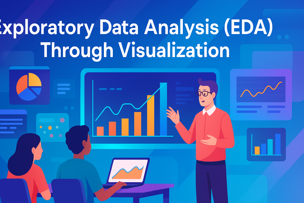
Visuals unlock data secrets. Use Seaborn’s histplot on the ‘Parch’ column— that’s parents or kids aboard. Bars show most folks traveled solo; zero hits the peak, with about 100 pairs or small families.
Switch to kdeplot for a smooth curve. It traces age distribution, peaking between 20 and 40. This tells you young adults dominated the ship.
These plots spot skewness too. A tall bar at zero? Most data clusters there. Vary your bins to see fine details, like age spikes at 20 or 30.
- Tip 1: Set
bins=20for clearer peaks. - Tip 2: Check for empty spots— they hint at missing data.
- Tip 3: Compare histograms side-by-side for quick contrasts.
Why bother? These singles views build your data hunch before teaming features.
Leveraging Relational Plots for Feature Interaction Insights
Pair features to see connections. Plot age against fare, hue by class. Three panels emerge: upper, middle, lower decks.
Upper class shows higher fares around 30-40 year olds. Peaks cluster high, unlike lower class spreads. Add gender lines—blue for males, orange for females—and females in mid-ages paid more in upper tiers.
Legends clarify it all. Blue dots mean men; orange, women. This mix reveals class trumps gender sometimes.
Such plots fuel guesses. Did richer, older folks fare worse? Visuals turn numbers into stories. Run sns.relplot and watch insights flow.
Understanding Distribution Summaries: Violin and Box Plots
Violin plots blend density and box summaries. The shape shows spread, like a violin—wide for dense areas, narrow for tails. Inside, a mini box recaps key stats.
Box plots shine with five numbers: min at the bottom whisker, max at top. Q1 marks 25% below, median splits the middle at 50%, Q3 hits 75%. The blue box? That’s IQR, or Q3 minus Q1.
A tight box means low spread—data hugs the median. Wide? Values scatter far. Dots outside are outliers, rare extremes like a 80-year-old.
For classes, box plots by age show upper deck skews older, around 40. Lower? Younger crowds. Use this to gauge survival odds.
- Outliers flag weird data, like super-high fares.
- IQR helps spot tight groups versus wild ones.
- Violins add shape—symmetric or skewed?—for deeper reads.
These tools summarize fast. Skip them, and you miss data quirks.
Section 3: Data Cleaning and Feature Reduction

Load with pd.read_csv('path'). Shape spits out 891 rows, 12 columns— that’s instances and features. Head shows a preview: five to ten rows of passenger IDs, survival flags, classes.
Info() digs deeper. It lists column names, non-null counts, types. Age has 714 filled; Cabin, just 204. Many blanks scream for fixes.
Run these first always. They map your battlefield. Spot floats for fares, objects for names.
Identifying and Handling Low-Quality Features
Some features drag you down. Name and Ticket? Unique IDs, no survival clues. Drop them to slim your set—data reduction at work.
Reduction cuts junk, boosts quality. Keep class and age; they tie to outcomes. SibSp (siblings) stays too—family might boost odds.
Ask: Does this predict survival? No? Axe it. This sharpens focus for models.
Addressing Missing Values: Decision Making for Imputation vs. Removal
Cabin’s a mess—over half empty. Ditch it; filling guesses adds bias. Age misses some, but it’s gold for predictions—younger folks swam better?
Remove rows with gaps first. That trims to 889 clean entries. For age, impute later if needed, but avoid wild fills that skew results.
Bias creeps in when you fake data. Stick to facts. Heatmaps highlight nulls in blue—Cabin’s a sea of them.
- Remove bad rows sparingly; they eat samples.
- For key features like age, average might work.
- Always recheck shapes after cleans.
Clean data trains better models. Messy inputs? Garbage predictions.
Section 4: Feature Engineering and Transformation for Modeling

Models crave numbers. Sex as “male/female”? Swap to 0/1. Embarked ports—S, C, Q—need numeric tags too.
Why? Math underpins ML; letters won’t add up. Most algorithms, like logistic regression, demand digits.
Decision trees handle categories, but stick to numbers for safety. Transform now, train later.
Creating Dummy Variables with Get Dummies
Pandas’ get_dummies shines here. Feed it Sex; out pop ‘Sex_male’ and ‘Sex_female’ as 0/1 columns. Embarked splits to three binaries.
This one-hot encoding avoids order assumptions. Male as 1, female 0? Fine for binary.
Run on subsets, then merge back. Your frame grows, but gains clarity.
Feature Transformation and Maintaining Numeric Integrity
Concat new dummies to your main data. Drop old Sex and Embarked— they’re redundant now.
Even 0/1 for gender? Still categorical, not numeric like age. You can’t average genders meaningfully.
All set? Scan for non-numbers. Clean means ready for math-heavy models.
Feature Construction: Discretization as an Advanced Technique
Turn age continuum into buckets. Under 18? Child class. 18-40? Adult. Over? Senior.
This discretization builds new features. Bins simplify patterns for classification.
It ties to transformation—raw numbers to useful categories. Test it; see if survival shifts by bin.
Conclusion: Readying Data for Model Training
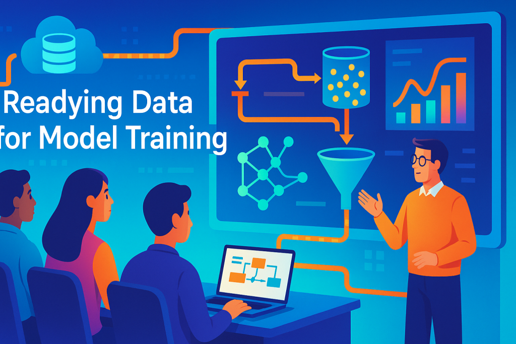
We’ve loaded the Titanic CSV in Colab, imported tools like Pandas and Seaborn, and visualized distributions with histograms, boxes, and violins. Cleaning dropped junk like Cabin and encoded categories into numbers, cutting rows to 889 and features to eight solid ones.
Your data now sings for classifiers. No bias from fakes, just pure insights on age, class, and more. This preprocessing builds trust—models learn faster from tidy inputs.
Next, apply Sklearn algorithms. Train a logistic model, evaluate accuracy. Grab your notebook, run the code, and predict like a pro. What’s your first survival hunch? Dive in and find out.